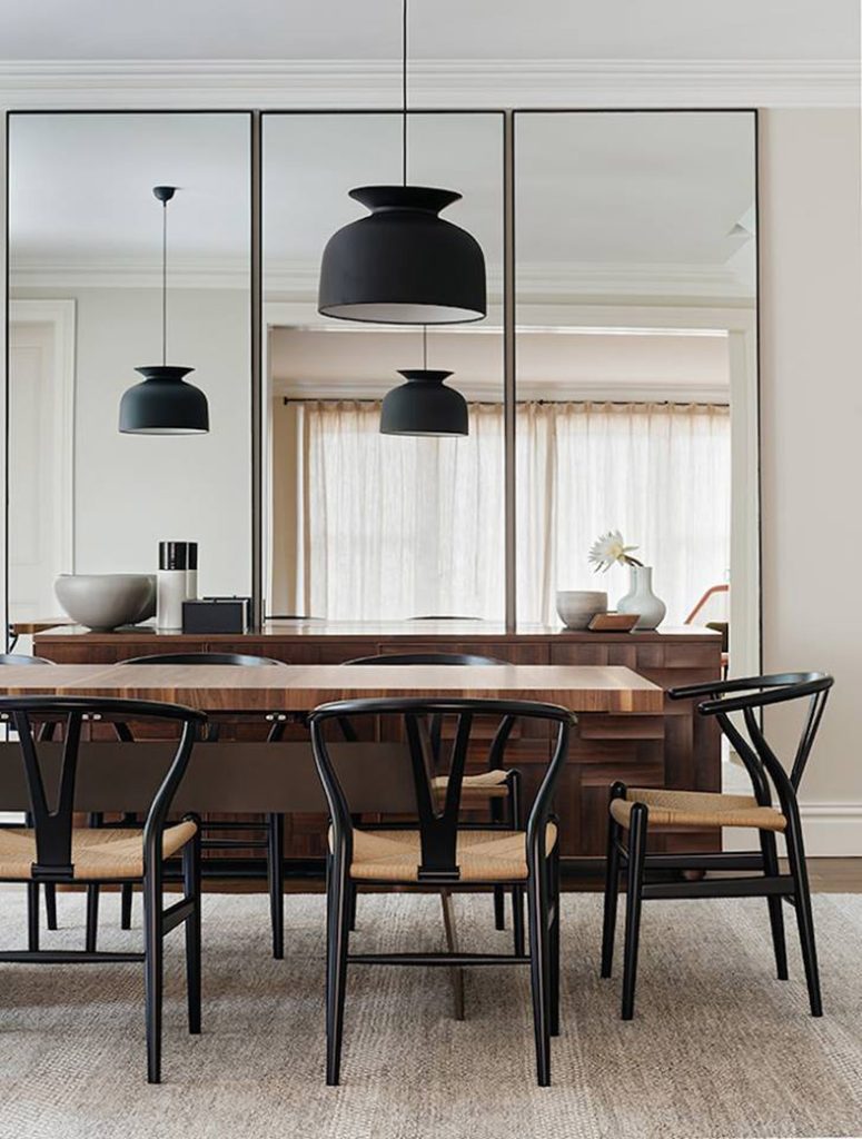
I meet many clients each week and it hasn’t happened yet where one of them tells me, ‘I have too much space, please make it seem smaller’. Inevitably, in every home there seems to be at least one dysfunctional zone that needs to be tweaked and re-thought. This seems to be increasing with the trend toward more compact urban lofts, condos and town houses.
Even in larger traditional homes, in most renovation projects I demolish certain walls to create that open and airy layout that is in such high demand. But this is an expensive strategy and disturbs your regular lifestyle for a little while. This is the reason I always begin with exploring with my clients’ options that are far simpler, more accessible, and definitely more economical!
Regardless of your budget, if you want to give the impression of more space you do not have to transform your home or office into a construction zone.
Here are a few simple ideas that will allow you to create a much roomier and cohesive living or office space.
The strategic use of tones and colours
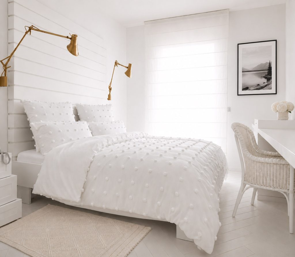
In this bedroom, there really isn’t a lot of room at all. In fact, I would call it tight, but this fact doesn’t seem very apparent, nor would it be too bothersome. With the absence of contrasting lines, pattern or color, our focus is not drawn to the lack of space but rather the abundance of light and serenity. Here is the benefit of the monochromatic palette (different shades of the same hue), the absence of excessive patterns or contrasting lines. It is a calmer and more seamless look, and this contributes to the spacious feel.
Design credit Versa Style Design
Paint the ceiling the same color as the walls
Design credit Versa Style Design
It works with the white bedroom, but this also works with a colour.
You have surely heard the recommendation to paint the ceiling a lighter tone, but I would like to show you AN EVEN BETTER STRATEGY, which is precisely AVOIDING the creation of a ‘line’ of demarcation between the walls and ceiling.
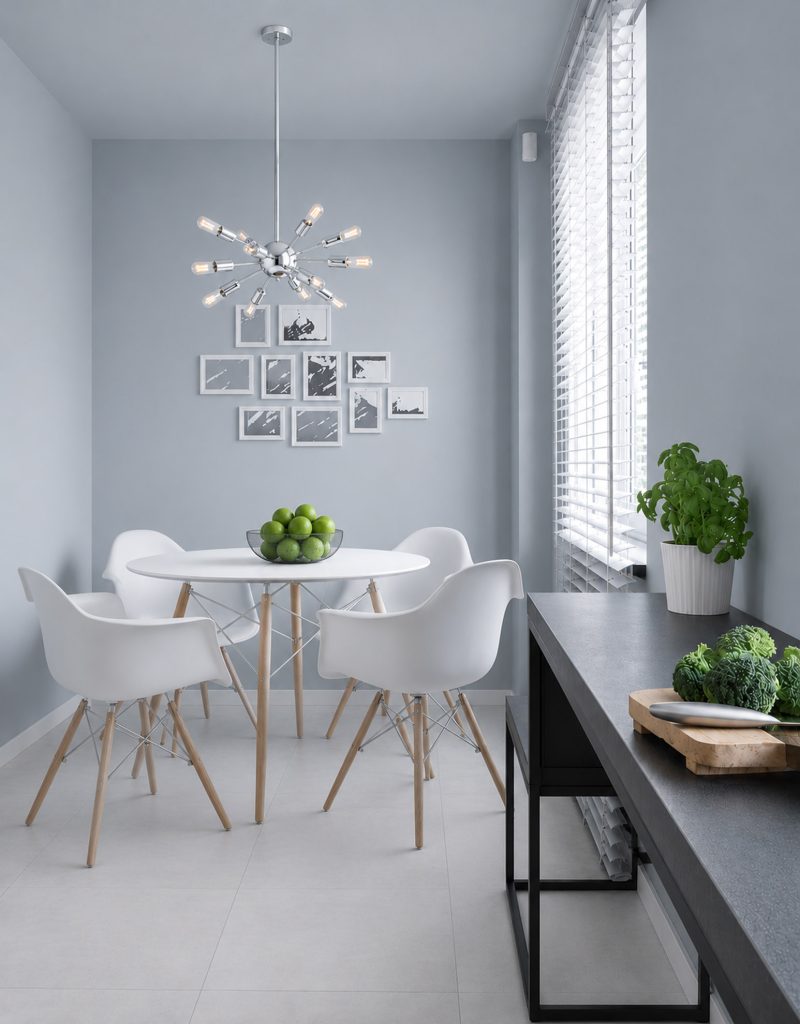
In this compact dining room, the ceiling is painted in the same shade as the walls. I know it’s darker than we are accustomed to seeing, but it still doesn’t seem heavy or suffocating.
We often hear fashion stylists telling us to wear one shade, like black, from head to toe so the silhouette line remains ‘unbroken’ and fluid. The same principle applies with living spaces. When choosing a color for a room, make sure to consult a professional who will help you make the selection in the space itself.
Integrate multifunctional furniture
This coffee table plays many functions. A piece like this is essential because it has all-in-one versatility; you can instantly switch from lounging to eating to working as well as having spacious hidden storage. It comes with 3 built-in compartments—ideal for keeping daily essentials like remotes, books, and chargers out of sight.
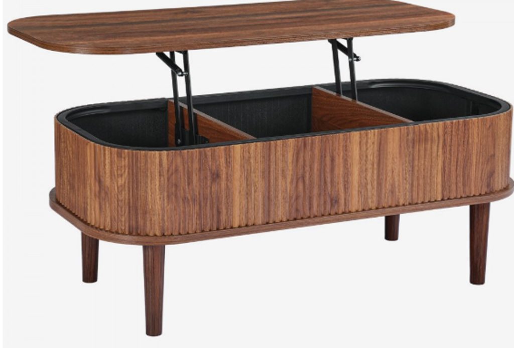
Furniture like this is pace-saving, efficient, and designed for modern multitasking. The lift top coffee table can rise reaching the ideal height for working or eating without strain.
Other examples include sleeper sofas, Murphy beds and ottomans that flip into tables and contain storage.
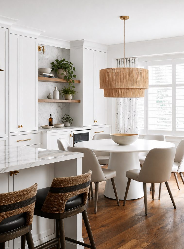
Use a round table instead of rectangular
Design credit Versa Style Design
Round tables are fabulously inviting. Everyone is face to face and there are no awkward corners to navigate around. If you have a super tight eating space, go for round, with the option to extend it into an oval for the occasional larger gathering.
Another strategy in small space planning is opting for larger scale items and reducing the clutter. In this eating space, the rattan chandelier is large and the items on the counter and shelves have been reduced to a minimum.
Learn how to use lines
Whether it is horizontal, vertical or even diagonal, the humble line goes far in stretching, widening and lengthening just about every time it is used strategically!
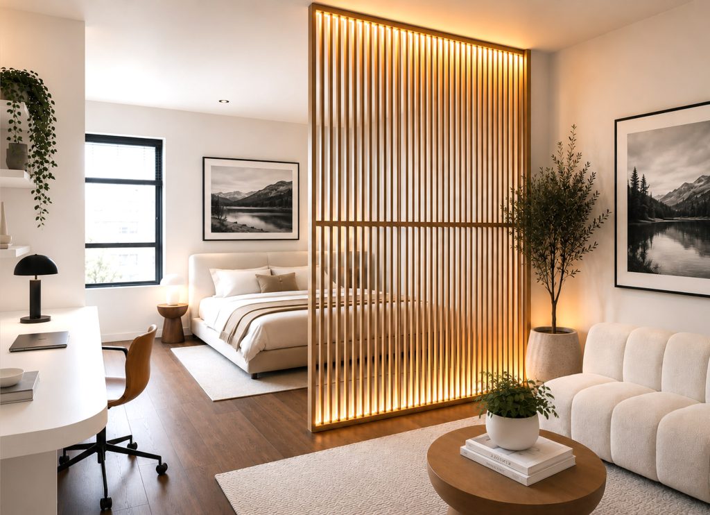
The vertical line
The vertical wood slats in this compact studio apartment serve two functions; a functional room divider that allows light to pass through and the vertical lines create the illusion of even more height. A solid wall would completely change this space creating a cramped feeling and the lack of light reaching the central living space would be very dark and depressing. Accent strip lighting at the bottom and top of this wood wall adds depth, light and visual interest.
Design credit Versa Style Design
The proper use of mirrors (and hidden storage)
Design credit Versa Style Design
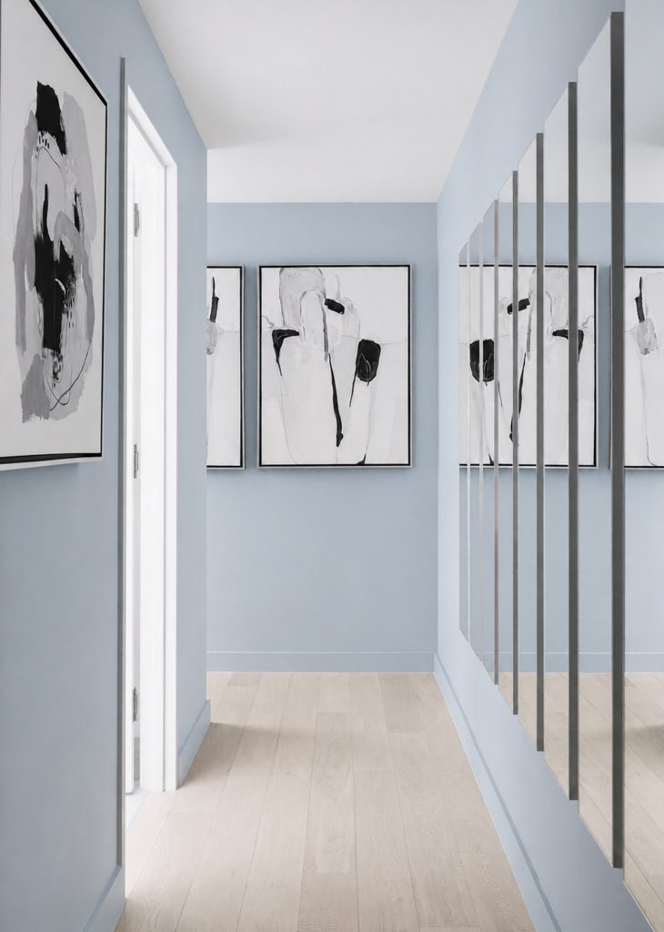
Strategically used, mirrors are a simple way of expanding a room or narrow hallway because they push back the wall as well as giving the impression of doubling the surface of what it is reflecting. This hallway is brighter because the mirrors are reflecting the light coming in from the bedroom as well as the bright and refreshing colour choices in the walls, floor and ceiling.
The abstract artwork creates visual interest without cluttering up the corridor. The bonus: shallow storage is hidden behind these mirrors; they are doors! Please always remember that mirrors need to be facing a clutter free wall, to avoid reflecting a wall of clutter, which would worsen the situation by doubling up on the messiness.
Furniture positioning
In this compact multifunctional kid zone, clean lines and right angles contribute to a sense of order and calm and communicate that there is sufficient space and that there are no obstacles to navigate around. All designers agree: Less is more! In other words, keep it simple and the elements basic.
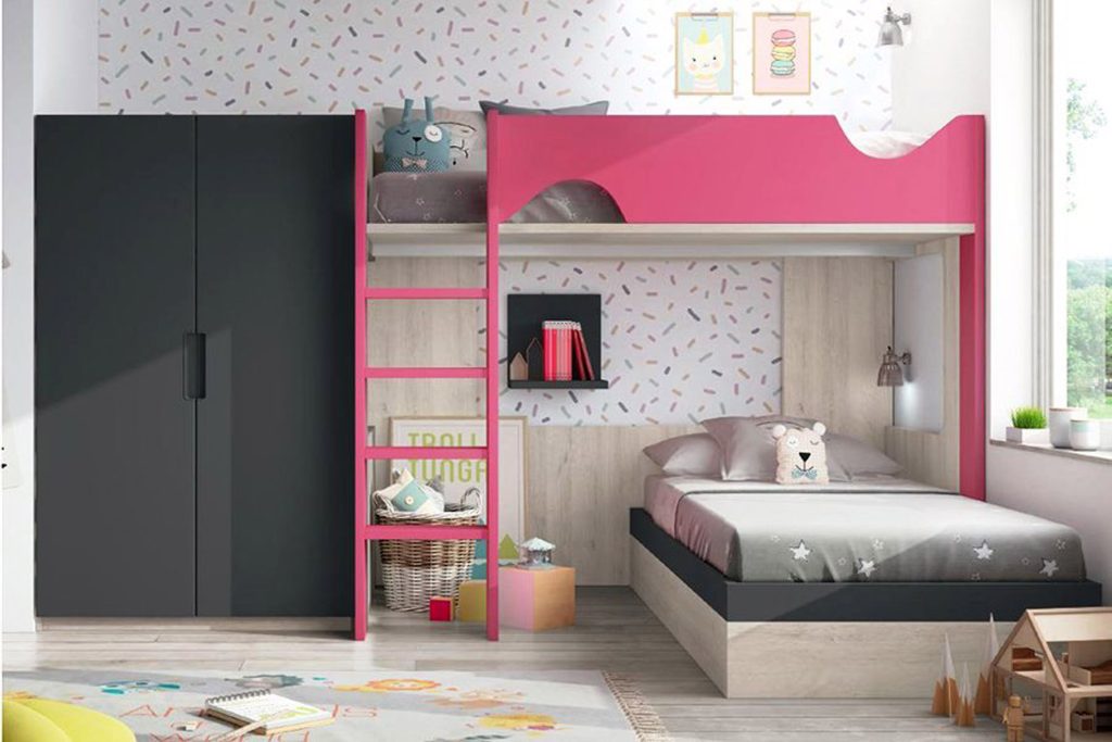
Avoid obstructions and furniture in the middle of the room as this gives the impression there is a lack of space. This is the reason I almost always recommend putting the biggest pieces along the biggest walls ensuring that the traffic can circulate with ease. The brain registers this and concludes that there is adequate space.
Hidden built-in storage
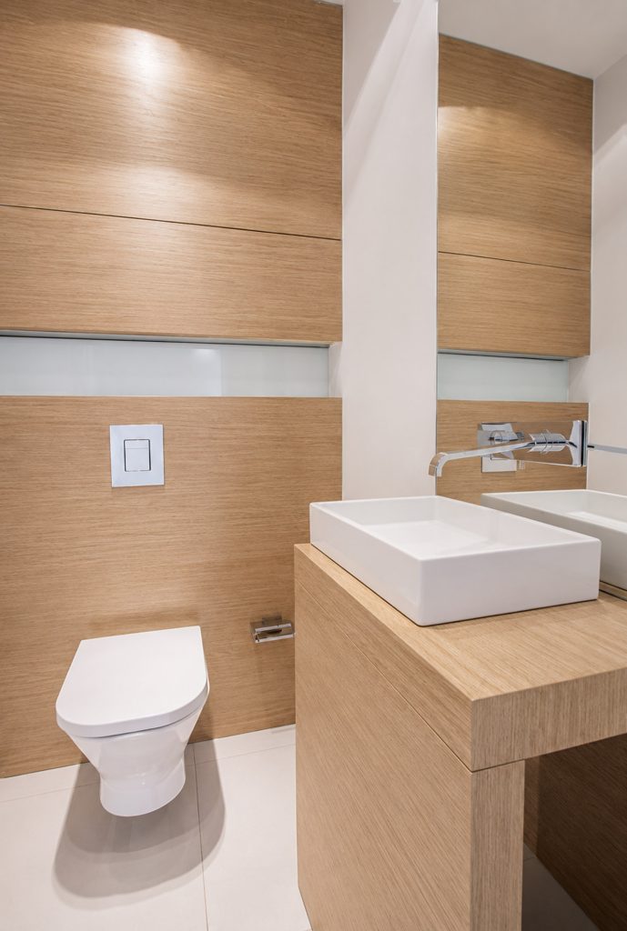
Even a super compact bathroom can feel organized and spacious if all the clutter is hidden away. If you are lacking in floor space, look upwards to maximize the vertical possibilities. In this stylish and elegant bathroom, custom cabinetry made use of every inch of wall space within a very small footprint.
The custom storage above the toilet is shallow but contains a lot of storage capacity. The mini vanity was custom designed to cover the smallest footprint possible and fitted with a mini vessel sink. By customizing this cabinetry, a cohesive and streamlined look is achieved making the small bathroom feel larger and uncluttered.
You would like to adopt some of these ideas in your own space but you don’t know where to start?
Contact us to transform your home or office according to your style, your budget and your specific needs. By discussing your project we can provide you with relevant information concerning our services, the process and our design fee.
Click here to contact us.
Are you located in the Greater Montreal Region?
Bring your design to life with Lucie.