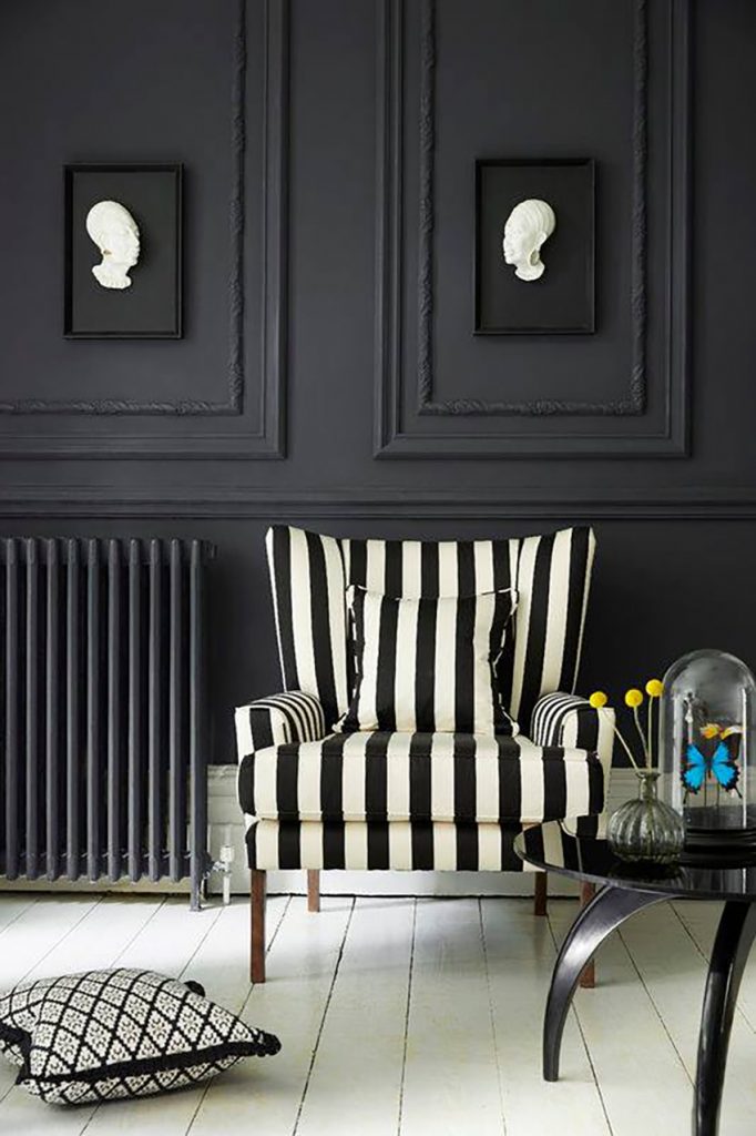
When it is used strategically and harmonized, this subtle and nuanced shade is perfectly elegant, dramatic, luminous, graphic and chic.
In fact, painting a wall black is considered quite trendy. Black easily adapts to any room in the house as well as the outdoors and can even be used in a child’s room. Frequently combined with white it is very present in the ever popular Scandinavian decor themes. When it is applied to certain architectural elements such as stairs, fireplace walls, beams and woodwork it adds value and elegance.
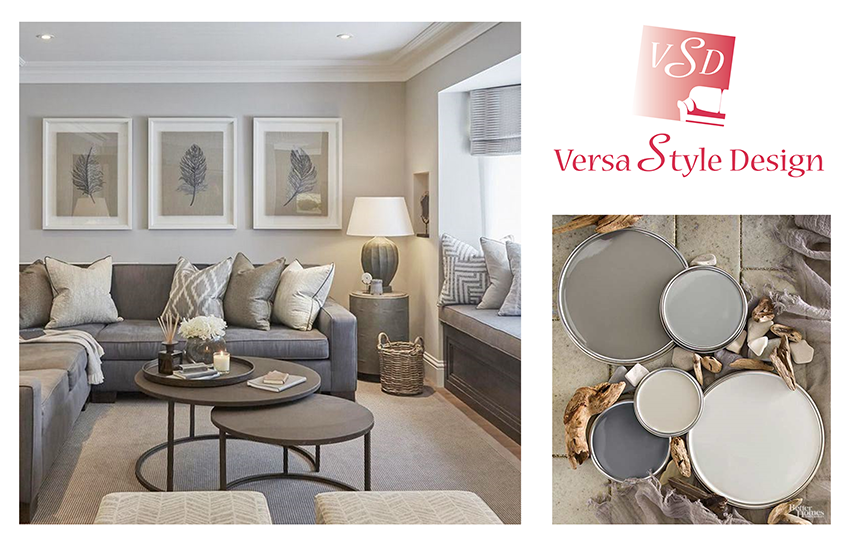
Clarke & Clarke fabrics available
with Versa style Design
When it comes to black everything is possible, whether you dare to use a lot of it or you choose to add it as an accent. In the bathroom, for instance, you can choose black plumbing fixtures, black floor tiles, a black free standing bath, a black vanity or limit yourself to a black and white backsplash tile. Today it is standard practice to paint old floor boards, shutters, main entrance doors as well as certain kitchen elements in black.
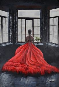
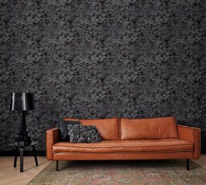
Black doesn’t stop there! We find it in furniture, lighting, table linens, upholstery, curtains, area rugs and even artwork like this painting of a red dress in a black room available with Versa Style Design.
So why is it that we love black in interior design so much? Because it is a shade that literally looks great with every other colour!
Here are some decorating ideas to inspire you to integrate more black into your home.
Paint the ceiling black for a refreshing and unique look
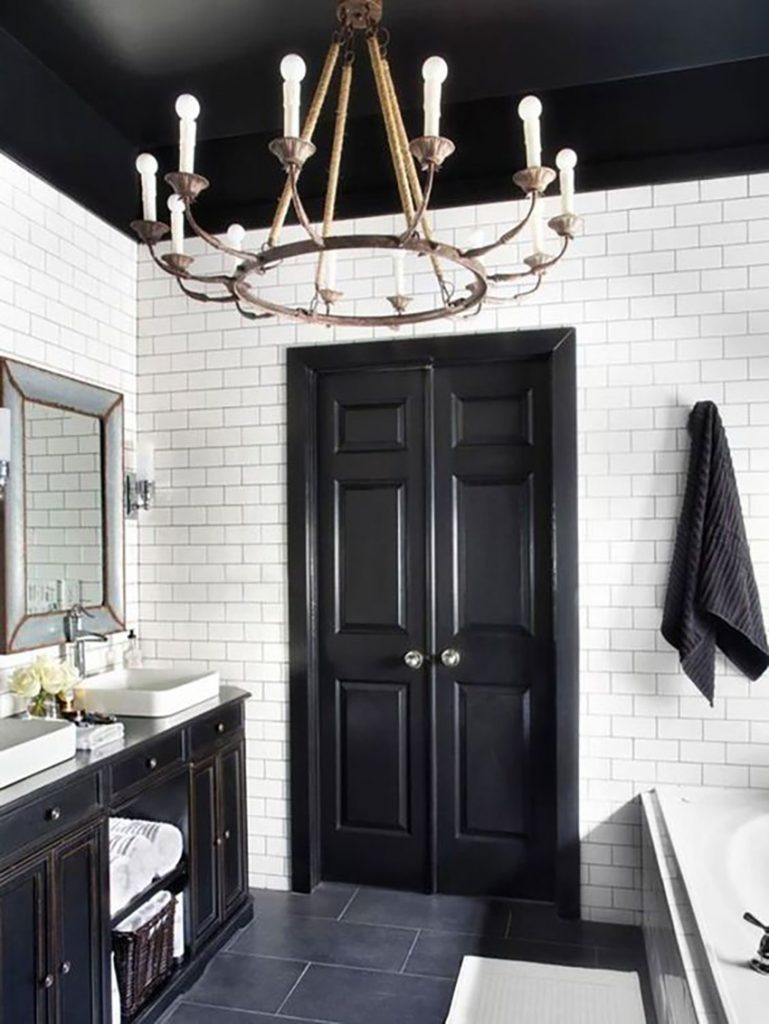
There is a reason why most ceilings are white or cream. In effect, white seems to make a room seem larger, it reflects natural light and it makes ceilings look taller. This is a well established design trick. If white is the designer’s friend, this does not by any means make black an enemy.
Painting a ceiling black is avant-garde as well as chic, providing there is sufficient ceiling height. A satiny and slightly reflective paint finish will also help in preventing a claustrophobic feeling while reflecting back the white of the surrounding walls, such as with this vintage looking black and white bathroom. Notice how good the black door looks as well.
Apply black on textured and high-relief surfaces
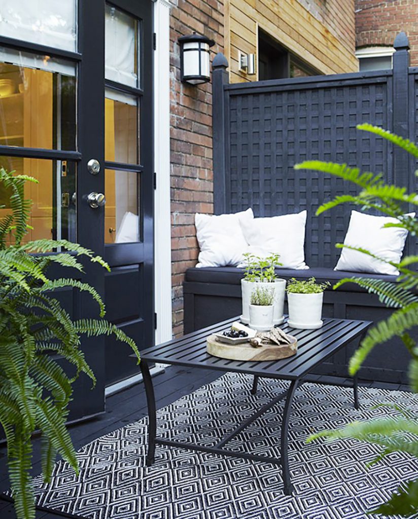
You want black that really makes a statement? Combine black with relief and geometric surfaces, and create a graphic effect by surrounding it with crisp white. Even compact spaces, such as this small yard will have style and character.
Notice, once again, the black doors have been painted in a glossy finish, whereas the wall and floor have been painted matte. The green of the plants looks almost fluorescent against a black backdrop. Black and green are a wonderful combination for the interior as well.
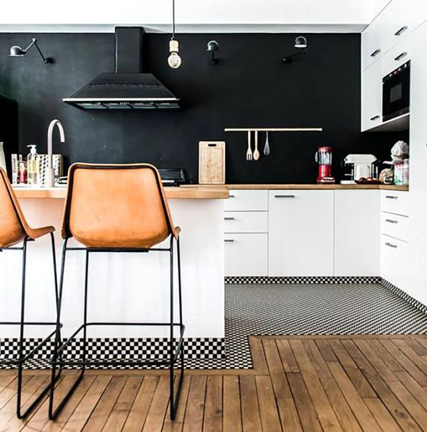
Revisit Scandinavian style with some black in your kitchen
Black kitchens are very trendy. Both matte and glossy finishes are popular. Black is very effective in small spaces because it creates an intimate mood. This kitchen has a lot of personality with its mix of black with blond wood, graphic checker floor tiles and white cabinetry.
This is a fast and simple way of adding a touch of Scandinavian style to any room; neutral tones, natural wood and geometric lines. It is best to limit the amount of furniture and accessories so the space is clean and organized. If there is an overload of information for the eyes to take in, the space will seem small and cramped. Keep it simple.
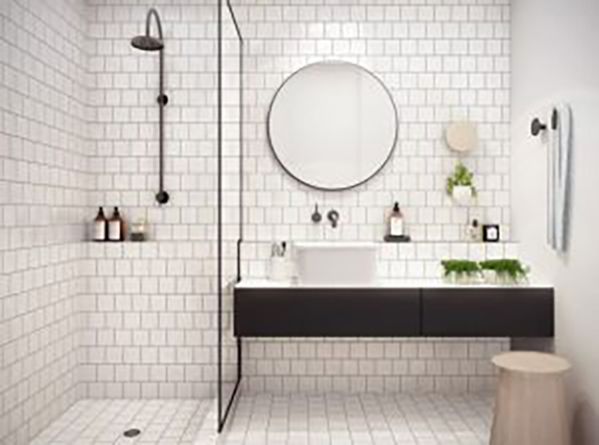
Black and white bathrooms are a trend
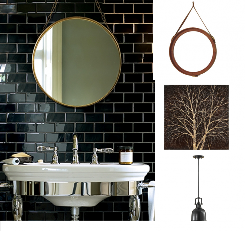
The combination of black and white in interior design is a winning duo. The total absence of colour creates a modern and refined feel, even if the style is country or vintage. Combining urban retro subway tiles with sophisticated fixtures and accessories adds an edge to the design. Notice how all the surfaces are lacquered and brilliant in order to reflect the existing natural light in this tiny bathroom. The remaining walls should remain neutral and simple. Mirror, artwork and lighting available with Versa Style Design.
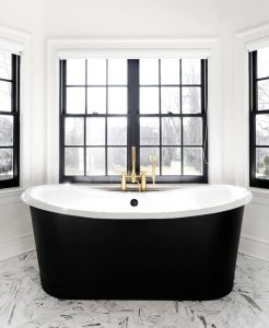
Black can be used in small spaces like bathrooms provided there is a strategic balance with lighting. This is why choosing reflective surfaces and finishes are so important. For a stylish and bold look, go ahead and choose a black free-standing bath and vanity, making sure to balance out the dark with a sufficient amount of a pale neutral tone such as white.
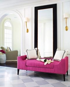
Inject some contrast into the design scheme
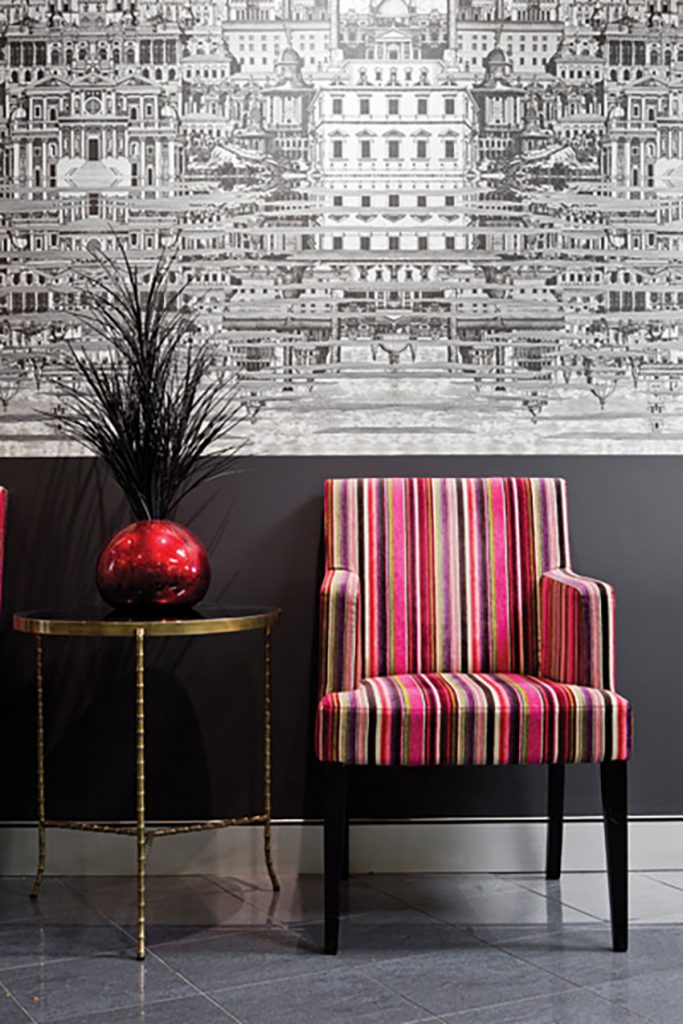
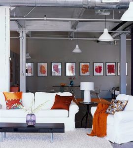
Opt for furniture in vivid or pale colours as well as accessories that will soften the effect of the black and make the décor scheme more pleasing to the eye. All rooms need a focal point that catches the eye and adds visual interest with a pattern or colour that really stands out. Wall coverings and fabrics available for every style and budget are ideal for adding that wow factor to a room.
Here, the Fornasetti wallpaper, the metallic accessories and the colourful striped fabric of the accent chair work together to create style and charm. There is absolutely nothing moody or dark in this small hallway.
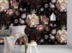
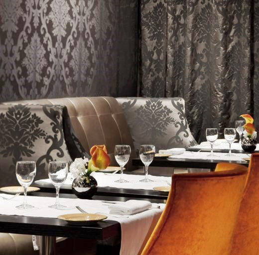
Consider black tone on tone patterns
Using subtle tone on tone patterns is a sure-fire way of adding visual interest to any room. A fabric or wall covering that produces a beautiful motif through its reflection of the light is a wonderful way to add style without adding a lot of colour. We can also see how much impact a single colour can have against a black background. Everything seems to pop and shine next to black! This wallpaper and fabric is available with Versa Style Design
Try painting a part of the wall
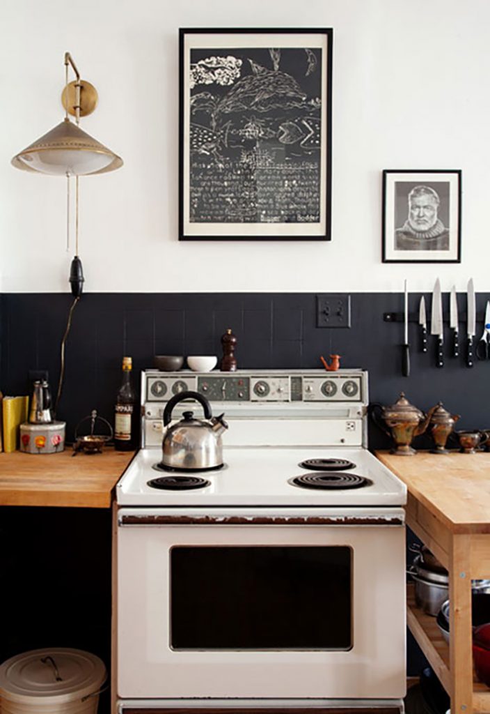
This is a great design trick…paint only a part of the wall, leaving the other part white. In this kitchen, painting the entirety of the four walls black would have been overwhelming, but painting the bottom half turned out to be just the perfect dose.
In this bright room, matte black paint is what is needed because glossy paint would create a distracting and annoying mirror effect taking away from the beauty of the black. With today’s technology, you can have a matte finish that is also highly durable and washable for rooms such as kitchens and bathrooms.
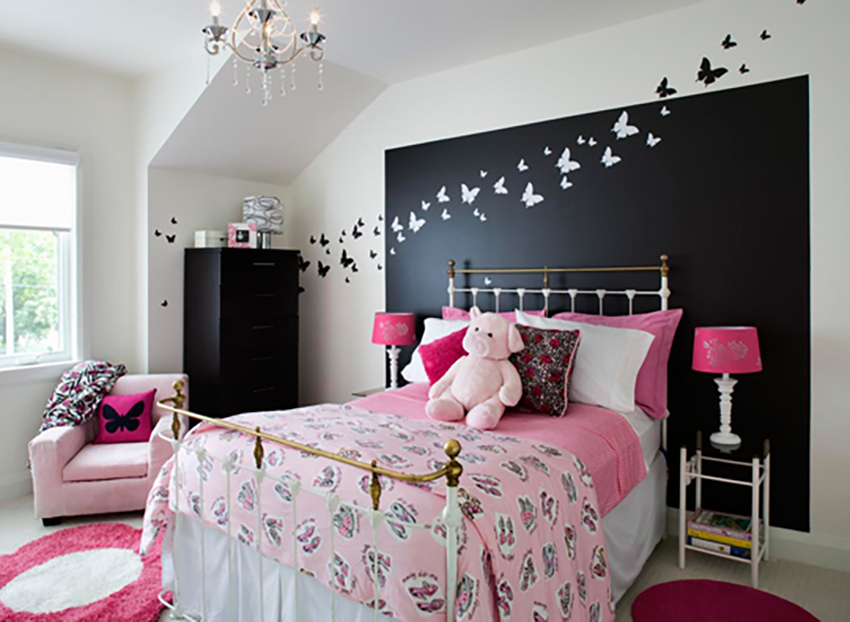
As we can see here it is possible to create a delicate room with black. In this case with Benjamin Moore paint, a huge rectangle as well as the corner chest of drawers was painted. In addition to creating a focal point at the head of the bed, black serves as an all important anchor to this otherwise very pale room. Small butterfly decals contrast nicely from black to white and add a feminine touch. This is a very economical DIY project!
The basic truth about black is that there are as many nuances of black as there are whites and creams. You can also experiment with different surface finishes such as matte, lacquer, metallic, mosaic and satin… the sky is the limit when it comes to designing with black.
You would like to adopt some of these ideas in your own space but you don’t know where to start?
Contact us to transform your home or office according to your style, your budget and your specific needs. By discussing your project we can provide you with relevant information concerning our services, the process and our design fee.
Click here to contact us.