Clever Design for Small Space Living
Making the best of your small space can be a challenge, but with the right planning, you can do a lot with a little. At Versa Style Design we believe that bigger isn’t always better, in fact many clients are selling their large high-maintenance properties and downsizing to simpler living so they have more time for other priorities.
In and around the region of Montreal there is definitely an increasing trend toward more compact urban lofts, condos and town houses. Studies reveal that many people are choosing smaller homes, allowing them to focus more time and energy on their families, traveling and hobbies rather than the extra time required cleaning, maintaining and repairing a larger house.
Design for Small Spaces
Do you wonder where to shop for all the smaller stuff?
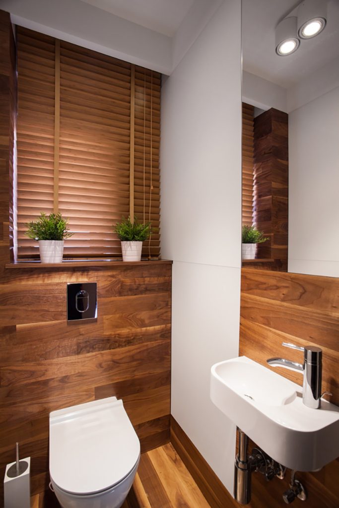
Living in a small space forces you re-consider everything that you purchase, not only because you have less available space, but also because everything is visible.
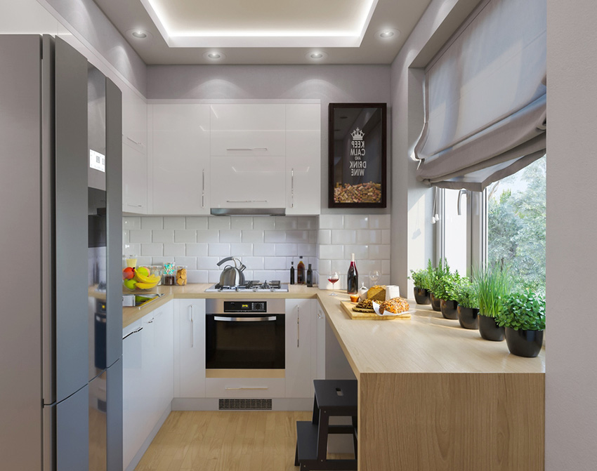
We can help you shop for functional and stylish small-scale furniture, compact organizers and clever space savers, whether it is for your teeny-tiny bathroom or an open-plan kitchen-dining-living area.
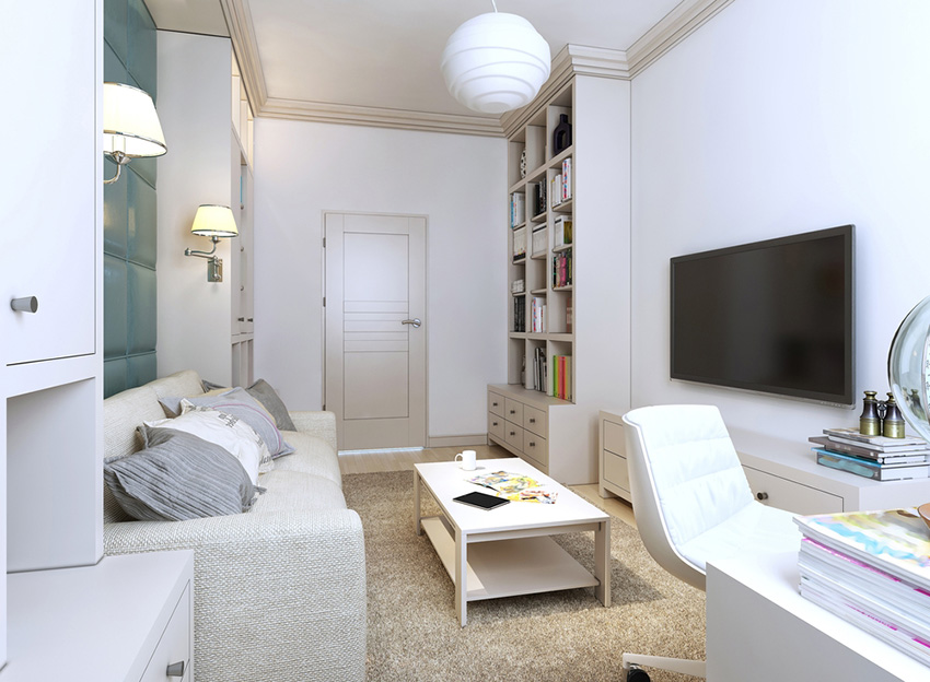
Design Functional Small Spaces
You can finally enjoy a small space that is big on function and style!
At Versa Style Design we use space-saving strategies and principles that optimize every square foot creating a more spacious feel, while keeping in mind your personal sense of style.
Here are some of our techniques for making any room seem larger;
- Coherent furniture positioning for increased space and ease of circulation
- We favour clean lines and right angles contributing to a sense of calm and order
- We frequently recommend a neutral or monochromatic colour palette
- We avoid using busy decorative patterns and contrasting lines.
- We share valuable tips for keeping the space tidy
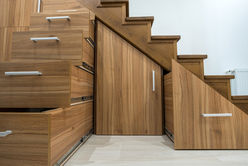
- We will show you budget-friendly storage ideas for every zone
- We will also include a quick lesson on how to use lighting so your small space will appear more spacious and inviting
Take heart – it’s not the size of the space that counts, but how you use it. Every single home can and should feel cozy, spacious and inviting. Don’t wait any longer, contact us!
Tell Us About Your Dream Small Space Design
Lucie’s Expert Interior Design Services
Following your initial consultation, you will be presented with 3 different design offerings:
Essentials
Plan your design project with care.
- Home visit with consultation
- Immediate on-site design session
- Hand-rendered floor plans with dimensions
- Hand-rendered elevation wall view plans in 3D
- Detailed storage strategies
- Space optimization ideas
Deluxe
Essentials service with more attention to the fine details.
- Essentials service
- Effective visual interview process
- New colour palette and finishes
- Detailed buying guide for purchases
- Showroom visits (private and public)
- Samples of materials and merchandise
Signature
Deluxe service with finer details and project management.
- Essentials service
- Deluxe service
- Trade recruitment and negotiations
- AutoCAD and 3D Architectural plans
- Assisted shopping
- Orders and deliveries
- Project supervision
Lucie is very personable, knowledgeable, creative and imaginative. She is extremely determined in attending to detail. Lucie has an extremely positive personality and is very easy to work with!
Suzanne Carignan, Private Nurses’ Aid
Montreal, Qc.
Are you located in the Greater Montreal Region?