There are many outstanding design classics that never go out of style. It may be an iconic chair, a stone counter top or a sensational piece of fabric. There are also classic colour palettes that go above and beyond popular trends and stand the test of time. Everybody instantly loves them and they can be adjusted to any style; whether rustic, modern, traditional or eclectic. They just seem to harmonize perfectly and always get along.
Here are the ones I tend to recommend the most…
Navy, white and red
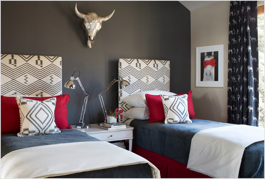
Not for the faint-hearted, this dynamic trio is a fast-track to a statement scheme. Hits of tomato red stand out against a soothing navy background, and splashes of white add a clean and nautical twist.
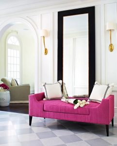
White, black and fuchsia
Think black and white is dull? Add a sharp pop of pink. Start with a scheme that is mostly white, add a couple of black accessories, then choose a statement piece of furniture or a single accent wall in daring fuchsia for a bright injection of colour.
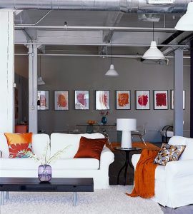
Dark blue with hits of orange
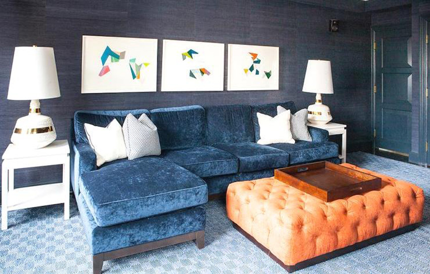
Take inspiration from this complementary palette and create a harmonious mix of colours and styles; velvety fabrics create an inviting area for lounging or entertaining. Give your scheme an edge with bright bursts of orange. Add accessories with hits of blue and orange to bring it all together.
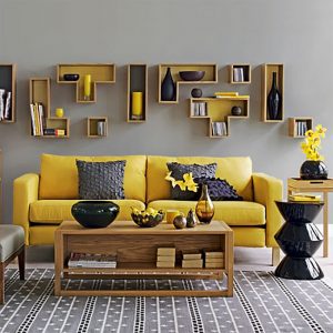
Grey and yellow
Stuck in a grizzly grey rut? Cast your eye over this versatile pairing. From statement furniture to delicate accessories, sharpen up soft grey with bursts of zesty citrus for a fresh look that packs a punch. It’s a match made in colour heaven!
Teal and mustard
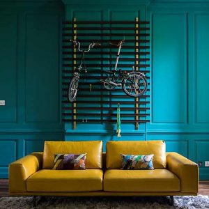
Not just for hot-dogs, a dash of mustard quickly adds depth to a room’s scheme. Team this moody colour with teal for a Seventies-inspired look that has plenty of character.
Charcoal, white and brick
Warm up a cool neutral scheme by teaming a rich charcoal gray with bold brick hues. Opt for grey-white furniture and stone-coloured walls, and then add accessories in bold shades of brick and terracotta for an earthy, but fresh mood.
Grey with wood furniture and floors
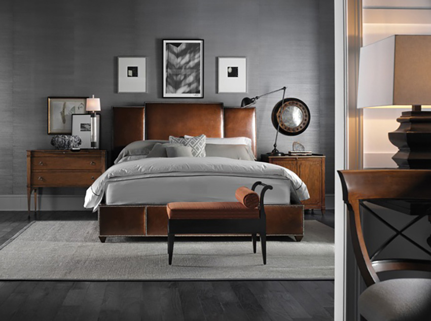
If you want your wood floors and furniture to stand out, don’t pair them with beige, but rather pair them with blue-greys or greys. Trust me; you will love your wood even more, regardless of your personal style.
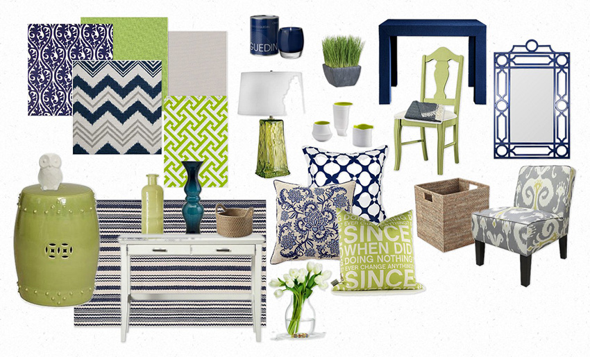
Crisp navy, white and green
This palette is fresh and summery, and it is great for kids, for women as well as for the guys, especially if you go with a nautical theme! Don’t be afraid to go with navy on at least one wall.
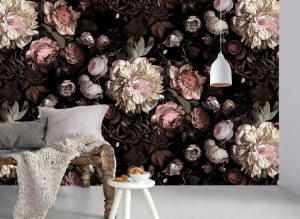
Black with anything
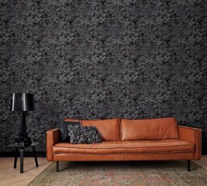
Black is no longer a taboo shade when it comes to home design. In fact it has become very popular. Frankly, every single colour seems to really pop out with a black background. Try to keep the clutter to a minimum so it remains sophisticated.
This is a dramatic choice so I usually suggest that my clients first try it in a powder room, vestibule or bedroom because they spend less time there.
White and sand
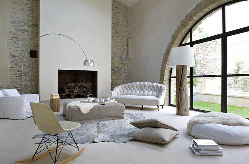
Because of the low contrast, this palette is gentle and easy on the eyes. It will never go out of style. Make sure you add textures so the space isn’t bland but rather visually interesting and inviting. In this living room stone is mixed with an animal skin rug, wood lamp and textured linen fabrics. Usually it is best to have a little more white than sand.
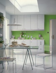
White with a hit of bright green
If you want a dynamic feel to the room then crisp white paired with bright green is a great choice. It is very important to make sure that most of your accessories are white to keep the look clean and pure. This space needs to remain clutter-free so if you aren’t up to the challenge, you should probably choose another palette that is more forgiving.
To conclude
More than any other factor in home design, it is colour that establishes the mood and ambience of a room; Choose colours that make you feel excited and alive, or serene and elegant. Also, wall paint is the most economical way of making a dramatic change in any space. Go with a palette that is harmonized to what you already own, pulling it all together.
Colour must be chosen in the room itself, with a variety of paper samples hung on the walls so you can evaluate how they look with the changing light. If you would like these convenient samples, contact us for a home colour consultation.
All of the furniture, lighting, ancestral stone, wallpaper, rugs, couches, beds and paint colours are available through Versa Style Design.
You would like to adopt some of these ideas in your own space but you don’t know where to start?
Contact us to transform your home or office according to your style, your budget and your specific needs. By discussing your project we can provide you with relevant information concerning our services, the process and our design fee.
Click here to contact us.