How to accessorize with attention-grabbing groupings!
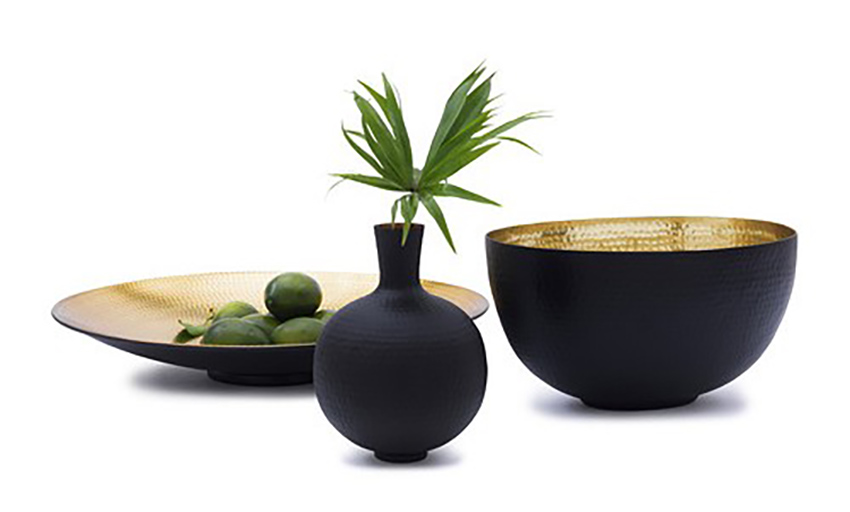
Near the end of your interior design project, a great way of successfully ‘pulling it all together’ is through the art of accessorizing. This phase adds the final touch and actually personalizes the space to make it yours. The room should, in part, be an expression of who inhabits it, as well as being extremely inviting for everyone.
When it comes to adding the final touch to an interior decorating project, here are some of the tricks of the trade for making your accessories look ‘just right’…
1. Arrange objects into simple groupings called ‘Vignettes’
A vignette is a featured grouping of objects that is accentuated through the use of great lighting and is positioned on a surface that needed some decoration. A vignette makes a room look more polished and pulled together so it is filling a vital need in the decorating process! You can make a vignette on top of any flat surface: the floor, a dresser, table, fireplace mantle, bookshelf, counter top or window ledge. Think of it as creating a beautiful still life right where you need one!
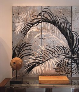
You can use accessories like vases, mirrors, plants, candles, photos, objects brought home from abroad, flea-market finds or other personal belongings to create ambience and to add a personal and unique flavour to the room. It is also a wonderful way of integrating cherished items, your personal artwork and heirlooms into your design.
2. Display objects in odd numbers such as 3 or 5
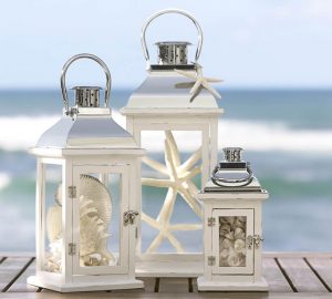
Place several objects of similar shape, size and colour together in odd numbers for maximum impact. Groups of three or five work particularly well and are stronger visually than a group of two or four.
3. Add depth by layering the items
Placing objects against a mirror, or leaning them against a number of different sized frames on a shelf, is an easy way to create a sense of dimension. Or, as in the case below, the layering was achieved with objects that stand alone and have enough variety in their sizes, colours and textures that the layering effect works!
Place objects from the back of the flat surface to the front instead of in a straight line the length of the surface. Position the smaller items in the front, staggered to the side just a little.
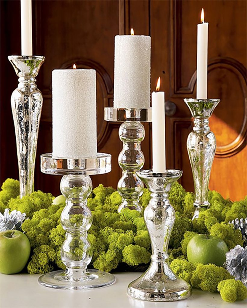
4. Vary the height, textures and shapes of the objects.

Mix hard and shiny accessories with rough and natural. Use weathered wood or iron architectural elements to introduce an unexpected texture. Photo frames, which come in finishes from shiny enamel to beaded, offer an array of texture options.
Use small pedestals to elevate items, or try stacking books to create a platform for smaller objects.
5. Let there be light!
Try integrating a lamp, candles or lanterns as in the photograph of the fireplace below. There is a small grouping on the mantle, as well as lighting within the ‘faux’ fireplace itself.
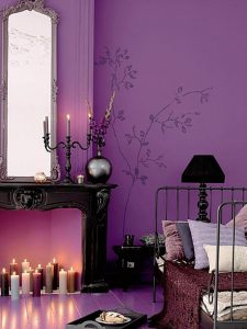
6. Symmetrical groupings for formal style, asymmetrical ones for casual…
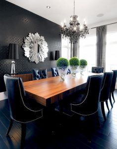
If your room is formal, a symmetrical design works best, as in the dining room below where every object is positioned in a cohesive and structured manner. Symmetry is always more sophisticated looking…
7. Integrate the right colour to create that ‘Wow’ factor.
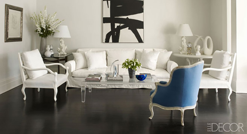
Add an item to the vignette in a shade that complements the existent colour palette of the room. The photo below is a good example of a coffee table grouping being tied into the rest of the design because it is 95% white with a small hit of blue (the bowl) as is the rest of the room…
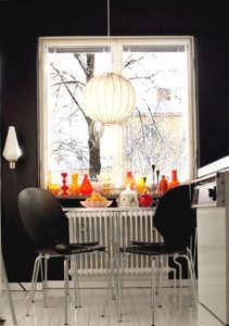
You can also use the vignette as a stand alone focal point. In the kitchen below, colourful vases grouped together in numbers were used to create a dynamic feel to the room, energizing it!
8. Stick to ONLY ONE theme in the grouping.
If the vacation photos are from the beach, add a seashell. If you happen to have a few collector items such as Vintage camera accessories etc, then go ahead a put them together. As a larger grouping they will draw the eye and create more of a statement than if they were spread out thinly here and there.
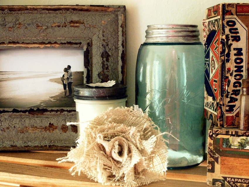
The creation of vignettes around your home will add value to your newly showcased belongings . Just remember to limit the quantity so they are captivating and draw a moment of appreciation as people walk by. Too many little items jumbled together are overwhelming . Just 3 or 5 items carefully placed in a simple group engage and draw the eyes, clutter is kept to a minimum, and all is well with the world, well, at least the inside the room!
You would like to adopt some of these ideas in your own space but you don’t know where to start?
Contact us to transform your home or office according to your style, your budget and your specific needs. By discussing your project we can provide you with relevant information concerning our services, the process and our design fee.
Click here to contact us.
